So far as I know, Google products are not regular winners of UX design awards. I don’t know, maybe from the sheer number of services they offer they’ve managed to secure themselves an honourable mention or two. Maybe they have millions of awards, I confess I did no research. Anyway, I do sympathize with the people who have to design interfaces for their products, many of which are complicated, powerful tools — I’m sure it’s challenging work. I also think the user experience of their products has improved over the years. Still, I’m confused how a company that size, with that much money (and that actually offers a course to earn a certificate in UX Design), could do something so wrong on a simple login page.
Now, if you think the criticisms below are really nit-picky, I would say you’re absolutely right. But I told myself I’d write at least one post a month this year, and if I can do one about something that’s been bugging me for a long time, it feels like a personal win-win.
Context
What we’re looking at is the way the interface handles logging in when you have multiple accounts. Specifically, what the UI/UX is like if you’ve picked the account you want to use, but then realize you actually want to log in to a different one of your accounts (I said it was nit-picky).
The Current Experience
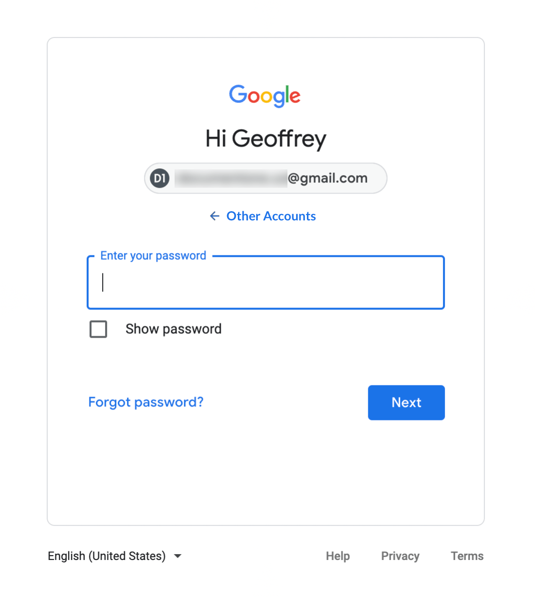
If you use multiple Google accounts in the same browser, they appear as a list of choices on the first panel of the login page. After choosing one, the content area animates to reveal the next panel, where you enter your password.


The issue is the downward-pointing icon at the far right of the email address. While it helpfully clues people in to the fact that it’s a clickable button, allowing them to switch accounts, it unhelpfully makes it look exactly like a “select” style input on a form. So the expected behaviour would be that all the options be presented as a list that appears once you click it, something like what I’ve mocked up below.


I’m not saying this is a beautiful, elegant solution, but if you’re going to use that little chevron icon, it’s absolutely how the UI should behave. Instead, what happens is you’re returned to the first panel, with the original list of accounts.
Fixing It
Since the first panel is already established (for the user, as well as in the code), it does make sense to repurpose it, in which case, a couple changes could be made:
- Remove the downward-pointing icon at right.
- Incorporate an account-switching “back” option somewhere on the panel to return to step one.
Some ‘Go Back’ UI Options


A bonus request is that they switch the direction of the animation when moving from step two back to step one. That may cause some to wonder if I’ve lost my mind, since I apparently have nothing better to do on a Sunday afternoon than scrutinize the direction of login panel animations. But I swear the change would make it better, or more simply, make sense. Since they animated forward from step one to two, then animate back when doing the opposite. Sometimes animation is just a flourish, but sometimes it can be meaningful.
Final Thought
I assume Google has a generous budget for UX testing, and that they made use of it to determine that the existing iteration of the login screen was the most effective and easily understood by users. But if that’s true, how did they end up testing a layout that misuses such a well established interface element? Only Google knows.