Like a lot of people, I do a fair bit of reading on my phone. News, magazine articles, occasionally a book. Apps dedicated to long form texts usually do a good job of making content very readable, but in a browser, I’ll often use “reading mode” to strip out a site’s styles for an uncluttered experience. Reading mode is great for users, but bad for content creators, who want often want users to see advertisements or important calls-to-action on their site. You can’t stop everyone from choosing reading mode, but by making your article pages as reader-friendly as possible, you can encourage more of them to stick to your designed browsing experience.
Looking at the site for the science magazine Nautilus, let’s walk through how some changes could create a better experience on mobile.
Starting Point
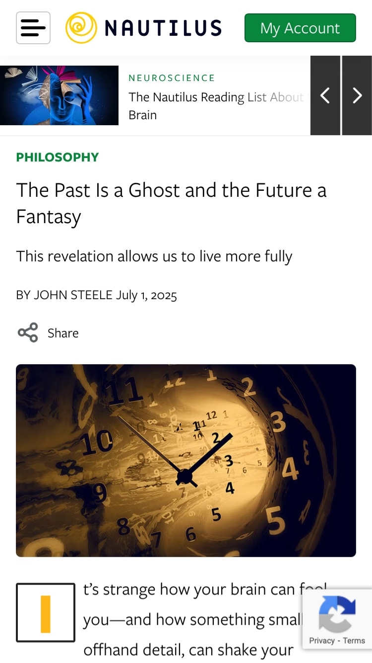
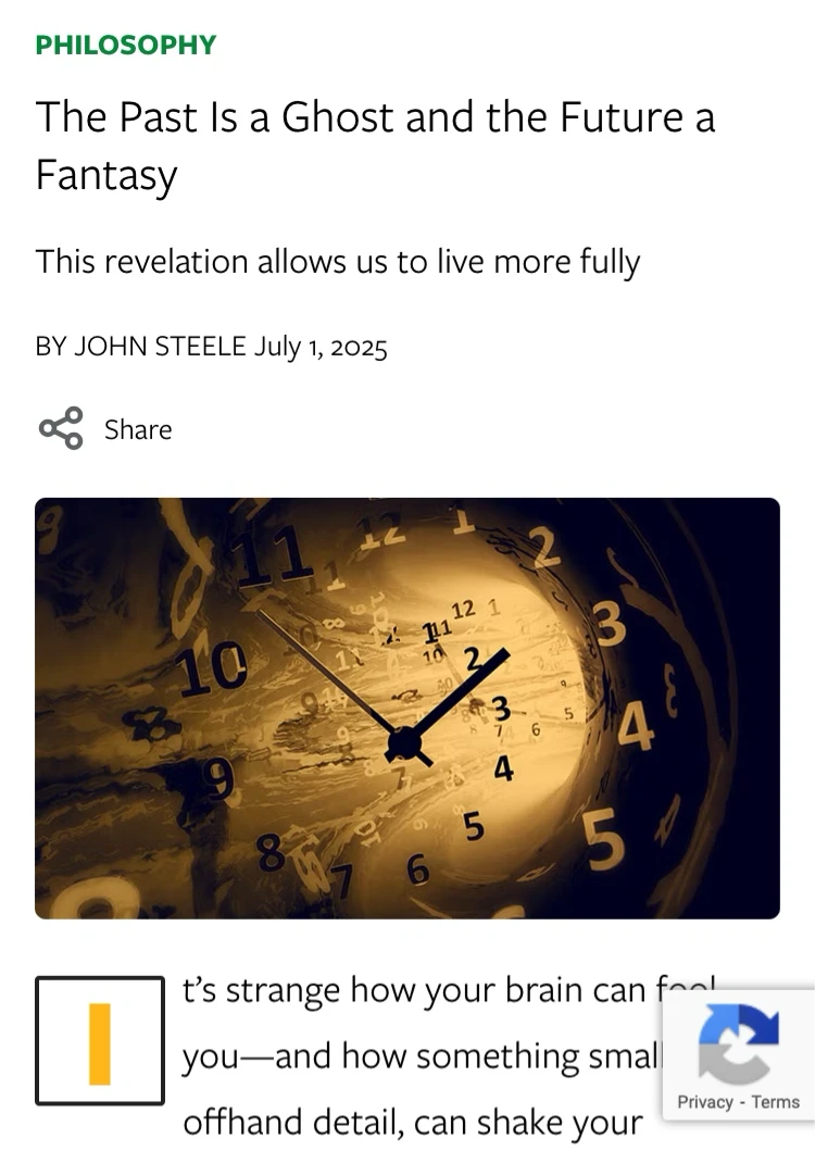
This is the current mobile layout for an article page, which has an abundance of box-y elements that pull the user’s eye all over the place. We’ve become good at ignoring things we’re not interested in, whether it’s ads, AI chat bots, or newsletter signup prompts. But everything on a screen requires evaluation by the user, even if it’s to ignore it. Let’s see how we can clean things up and put the focus on what this page is all about: an article.
Header
Current
Current
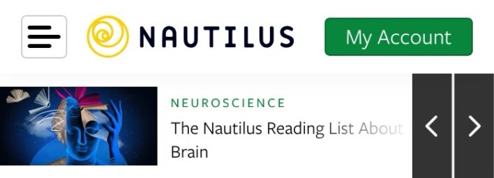
Menu/Logo: The close placement of the menu and logo icons takes away from the presence of the brand.
“My Account”: This doesn’t need a button-style treatment, as it’s not a call-to-action like “Subscribe”.
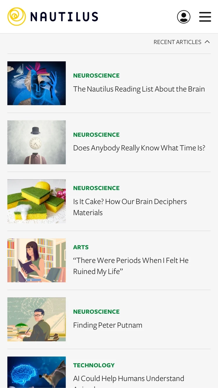
Recent Articles: The high placement and strong visual elements (image, eye-catching navigation) makes the carousel more important than the actual article below. Also, horizontal scrolling is not a great article-browsing experience, especially on mobile (small text size, can only see one article at a time).
Revised

Revised
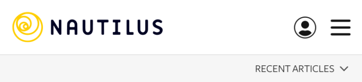
Placing the logo on the left anchors the site with the magazine name. The menu on the right is more conventional, and a simple icon for account access helps keep things tidy. We replace the recent articles carousel with a dedicated menu (more on this in a moment).
Content Area
Current
Current
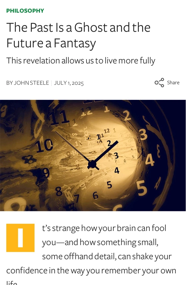
Title: The type size is not distinct enough from other texts on the screen.
Captcha Icon: This isn’t needed here. It’s just clutter that’s blocking the article text.
Revised
Revised
Larger type for the article title draws the eye to the most important thing. Applying an edge-to-edge style to the main image reinforces the break between the article’s header and content areas. Finally, a bolder, inverted style for the drop cap helps it better anchor the start of the article.
Before & After
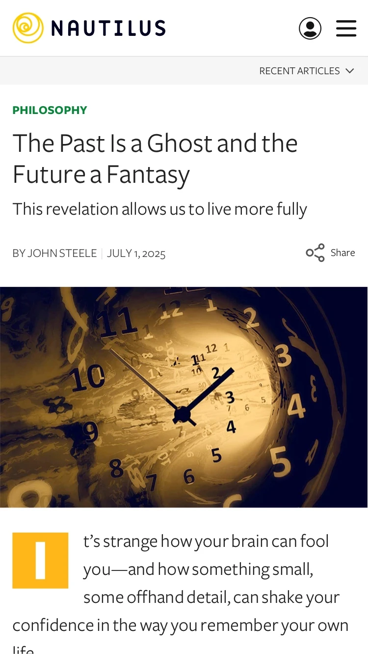
Here’s the header and content together, as it is on the current site, compared to the revised version.
Accessing Recent Articles
By replacing the carousel with a menu, we keep access to important key content, but we accomplish three things:
- Save vertical space with a smaller footprint.
- Remove the visual distraction of the carousel, when the focus should be on the article.
- Deliver a better interface for quickly scanning multiple articles.