To do my part supporting the apparently-always-teetering-on-the-edge-of-the-abyss news industry, I have a subscription to The Globe and Mail. When I first signed up, after some brief poking around the site, I decided to stop procrastinating and get back to work. I only had to do one last thing on the site. Something simple. Very simple. Something I’ve done countless times, on countless websites. And yet, for a moment, I was completely confused. The wall I’d hit was this: how the hell do I sign out of this site?
When it comes to web interfaces, I like standards. The less surprising the UI is, the better. In the world of UX, when new challenges arise, the web goes through a period of evolving various solutions, one or maybe two of those become the norm, and then everyone adopts those options. People don’t want to learn how to use your website, they just want to get to the content. When I start work on a new project, I don’t, for example, begin by exploring new and exciting ways for people to access the site menu on their phones. I put three horizontal lines in one of the top corners of the header and move on.
With signing in or out of a site, the most common spot you’ll find these links is at the right end of a site’s header. “Sign in” is almost always directly accessible in the header, while “sign out” might be in a drop-down (off an account/username menu item). But basically, both options are up there in that general top right area. There are the wild, free radicals who’ve switched from a top header to a vertical left-hand “header”, in which case the logout is usually at the bottom of the bar. In that layout, the bottom left corner makes sense, though I’m unconvinced about left-hand menubars. But I promised myself I’d only complain about one thing per post, since the number of nitpick-y UX issues the average human can tolerate reading about at once is one (if indeed the number is above zero).
The Right Way
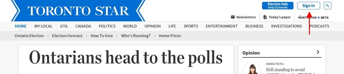
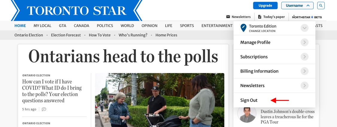
Before we get to The Globe’s bizarre implementation, let’s be mean and look at how a competing newspaper does it beautifully, and boringly right. Over on the Toronto Star’s site, we see our “Sign In“ link in the top right corner. Then, once we’re logged in, from that same spot, a drop-down menu provides our “Sign Out” link (bonus points for making it the bottommost option). Dull, brainless, perfect.
A Bizarrely Wrong Way
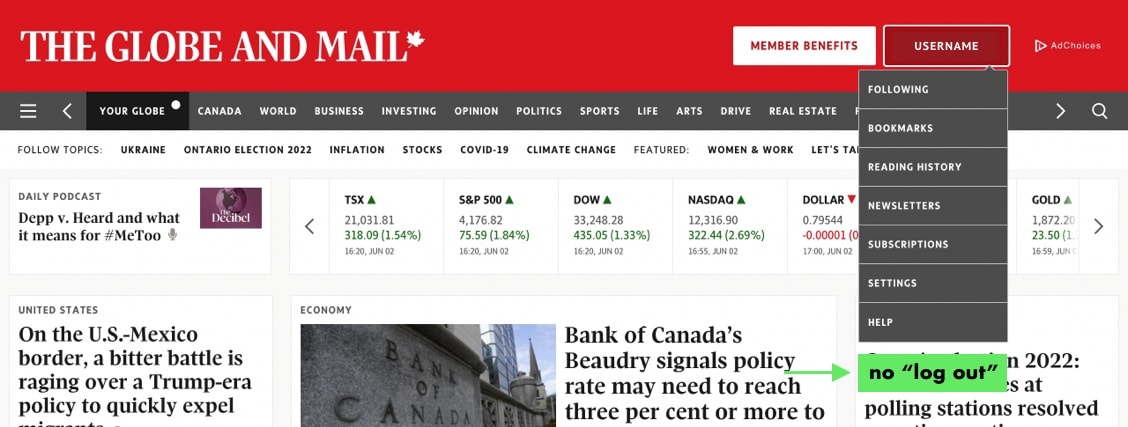
At last to The Globe. We start with a standard, top right “Log In” button. So far, so good. Once logged in, like The Star, we again have a drop-down from the same spot, except for… no logout option.

So how do we get out of here? Well, instead of one obvious solution, we’re provided with two less obvious ones. The first is not a huge stretch: “Settings” in the drop-down is the most likely place to check, and indeed, this leads to an account management section, where the “log out” link appears in the top right corner. I’ll spare you the screenshots on this one.
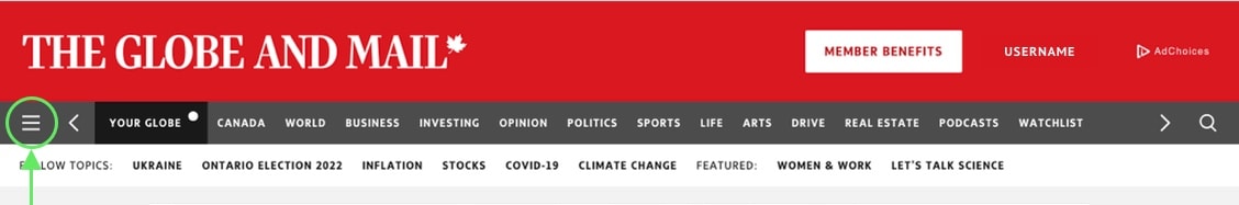
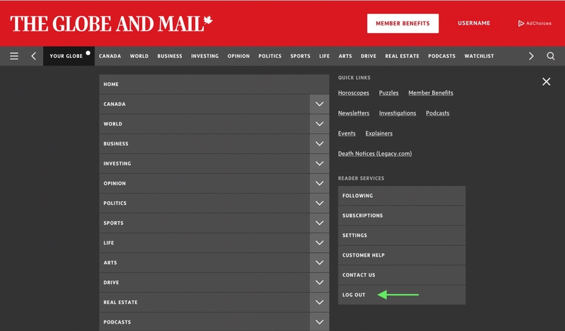
The second path is rather odd. Way over on the opposite side of the header there’s a hamburger menu icon. It opens a full site menu, in which we discover a “Reader Services” section, where, lo and behold, we find the logout link.
There is, to my knowledge, no data to challenge my position on this, so I will boldly claim that every single person who has ever logged in to the site has found these two logout options to be, at best, a little weird. However, I do acknowledge that I am probably the only person to take time out of their life to write over 700 words about it, and, fair enough, that makes me a little weird.
As a final note, if anyone’s thinking You log out of news sites? What are you, some kind of old, paranoid, obsessive curmudgeon? I say to you yes, yes I am. But my grumpy, web-surfing ways are irrelevant. The point is it’s the user’s choice whether they want to sign out or not, and there’s an established standard for where we should find that option. Stick with it, and make your site visitors lives easier.