I used to make Flash sites. Go ahead, laugh (or wonder aloud “WTF is Flash?”). Designers and clients loved it because you could create a custom, animated, interactive world, bypassing the humble capabilities of a web browser. People made games with it. Movie studios promoted their films with it. The art and design publisher Taschen released a book showcasing the best sites. The movement away from Flash was mostly about adopting open web standards, but the nail in the coffin was when Steve Jobs stood on a stage and basically told the world it could have iPads or it could have Flash. The people chose.
Nowadays, the idea of a fixed-sized canvas for your site that could only be viewed by installing a plugin seems absurd. But it’s easy to laugh at old tech from the early days of the web. It’s harder to shake off lingering, stubborn misconceptions about what a website is, period. Below are some of the ones I still encounter on projects: four things your website definitely isn’t.
1. An immersive experience
“One of Flash’s primary uses was for building fully immersive, interactive websites.”
— Wikipedia
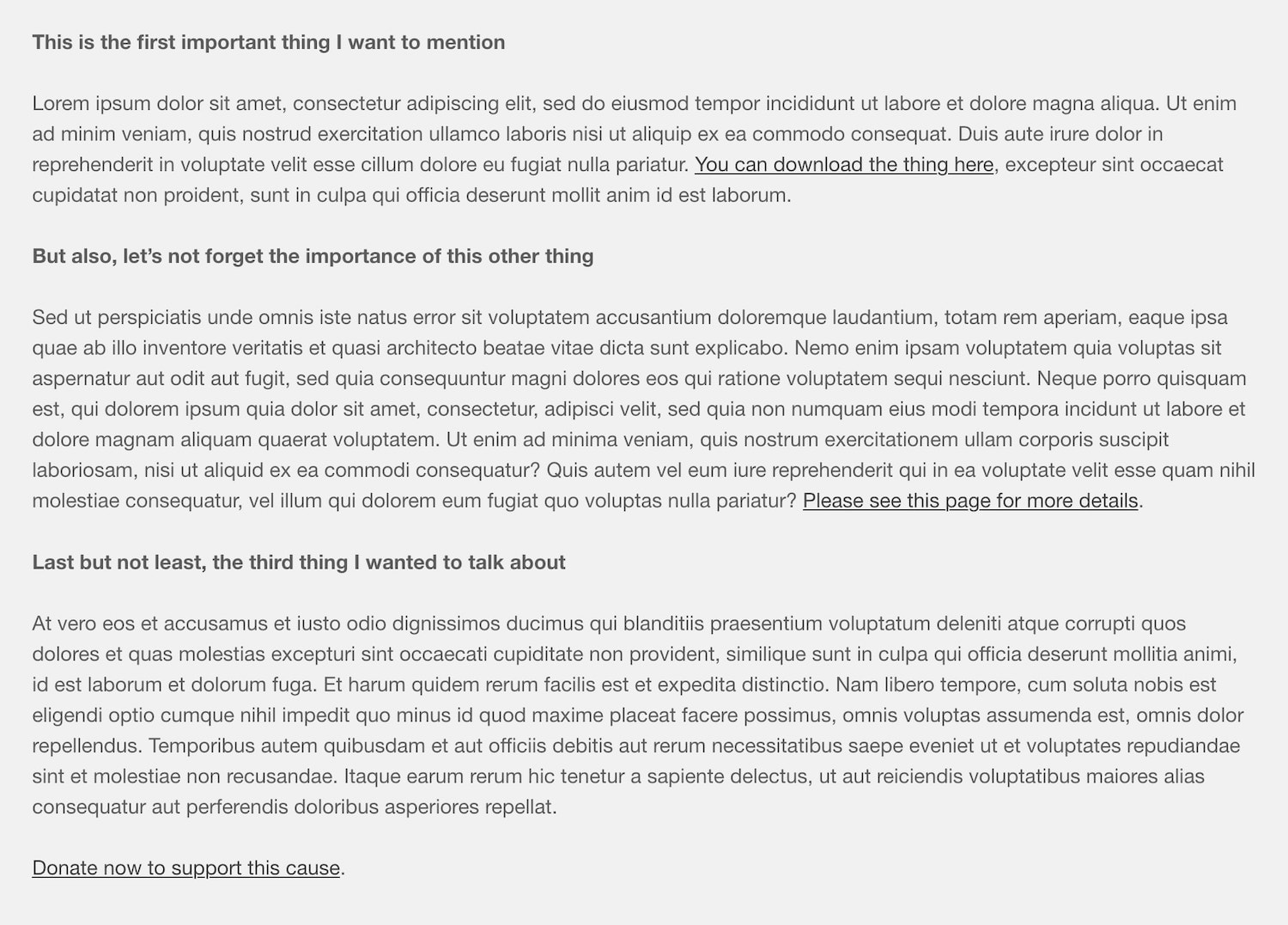
Flash may be dead, but it left behind the notion that a website can deliver an “immersive experience”. I still encounter the phrase in project proposals and kickoff meetings. But until we’re all wandering around with VR headsets at the ready, there’ll be no such thing.
The reason is that there is no one, single experience of a website. Screen size, data connection speed, and a user’s real-world context mean the experience varies greatly. It’s nice to imagine someone’s dimmed the lights, poured themselves a glass of wine, and put on your recommended playlist; relaxed but mindful as they explore your site on a 27” iMac. But they’re just as likely to be taking it in on their aging, cracked-screen iPhone 7, half asleep on a crowded bus during a morning commute.
Thankfully, what most people mean by “immersive” is fairly straightforward: an uncluttered interface, with big, beautiful images and engaging copy. That’s obviously fine, but don’t view elegant design as the secret to immersion. Design matters — make your site look great — but what matters more is the quality of your content.
Which leads me to confess that I lied, a little. Users can become immersed on the web, in whatever content they find engaging. That might be a 15-second video, a 3,000 word article, or some data visualizations. Whatever it is, it’s the value of that particular content to the user that matters, not how well you dress it up.
2. A casino (or a circus)
People love to jazz up their websites, which usually means adding animation. But unless you’re running a casino or a circus (if so, permission to skip ahead), use restraint in this area. Subtle touches can be nice and bring life to the browsing experience: images and other elements fading in or sliding into position; buttons or other elements changing colour or moving slightly when you interact with them. Just keep in mind that animation draws the eye, and it’s very easy to overdo it. Before you know it, you’ve created a distracting – or worse – irritating experience.
Years ago I worked on a project where a client pushed for as many animations as they could get. They wanted this specifically — I’m not making this up — to counteract their belief that the site’s subject matter was dull. I’m still dumbfounded. If you feel your content is not doing justice to your organization, then re-think your content strategy and explore new ways to tell your story. No amount of sliding, spinning, scaling animation (or all three together!) can make dull content compelling. And consider that your audience won’t care: if the content’s value is practical in nature, does it need to high-kick its way onto the screen?
3. A novel
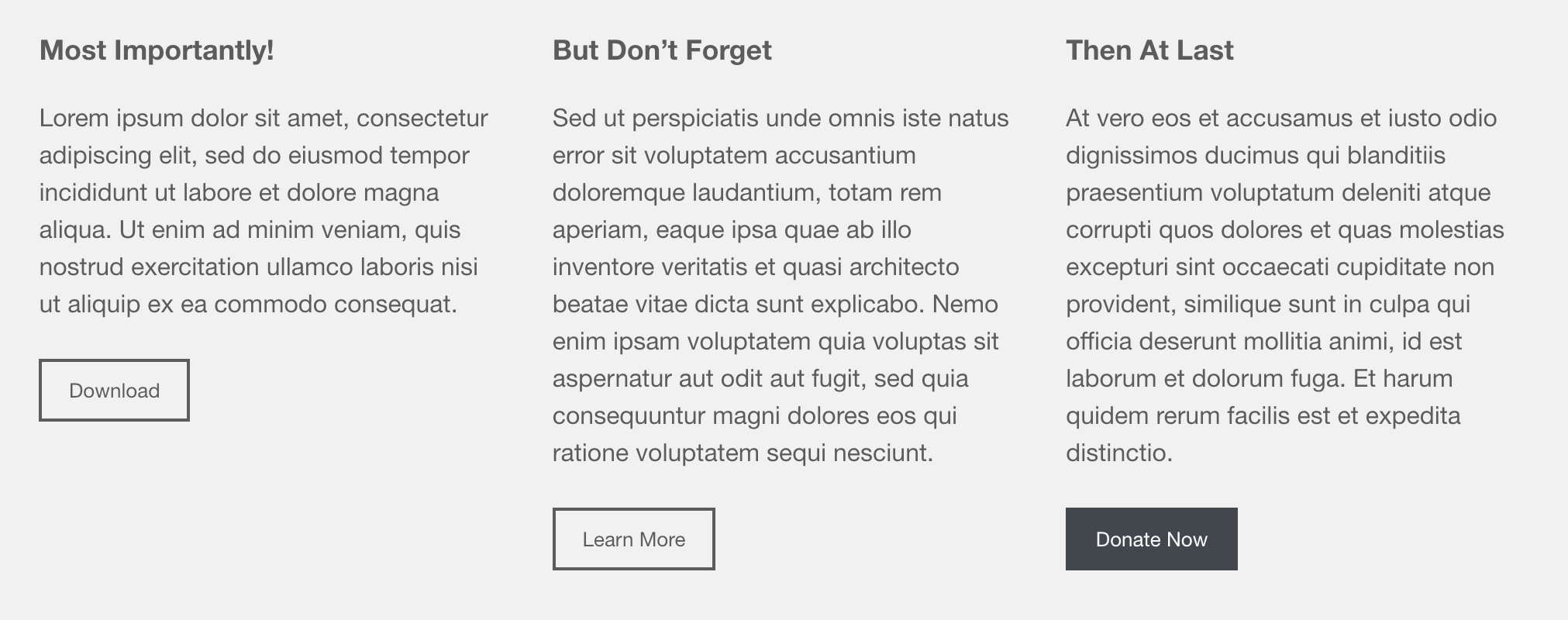
Small companies rarely have a dedicated person to manage their site. Often, the task is dumped on someone who already has a full-time job. If they don’t have experience creating web content, there’s a tendency to format things as they do other content: usually long office memos or emails.
But other than obvious content types like blog posts, news or articles, avoid long texts on your site. Don’t make users read through multiple paragraphs to figure what’s relevant to them. Not only should you tighten up copy, you should take advantage of whatever simple layout tools your CMS offers, and make your content easy to skim. Using WordPress’ block editor, it only takes a minute to turn a long series of paragraphs into three titled columns, with clear actions.
4. A piece of paper
I can’t remember the last time a client asked “what’s responsive web design?” Yet when it comes to their own site, people can get fixated on a specific screen size (usually a big one, or sometimes the exact same laptop as their own). But you’re not designing a physical brochure. You’re not even designing multiple brochures for phones, tablets, and desktops. You’re creating an interactive, flexible space where the user gets to drive. The web is not a medium for layout control freaks.
A classic example of layout obsession is wanting to add a linebreak to a page title, to avoid having the last word fall onto a second line. The problem of course, is that a solution on one screen can lead to a problem on another.
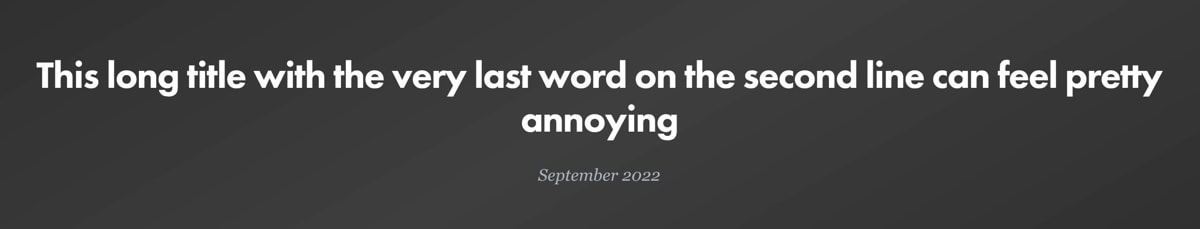

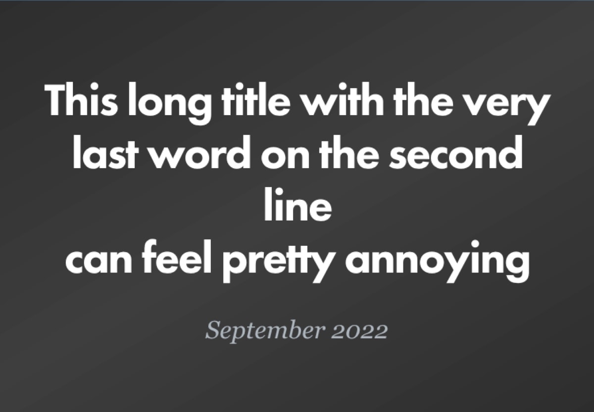
Google will lead you astray with techniques for managing line breaks (a WordPress plugin, some custom HTML/CSS), but you’re kidding yourself if you think you can have your way with the web. Between the ever-expanding range of screen sizes, people using browser preferences to override your type styles (for accessibility, or aging eyes), and maybe even the occasional browser quirk, you may as well be facing an infinite number of scenarios. There is one solution though, and it’s 100% reliable: let it go. The web demands a go-with-the-flow mentality. Sometimes, your sanity depends on it.
In Summary
- Substance over style: Worry about your content first, aesthetics second.
- Adding animation? Keep it simple.
- Where copy is concerned, brevity is your friend.
- Let go. Pixel-pushing in the responsive world will drive you crazy.